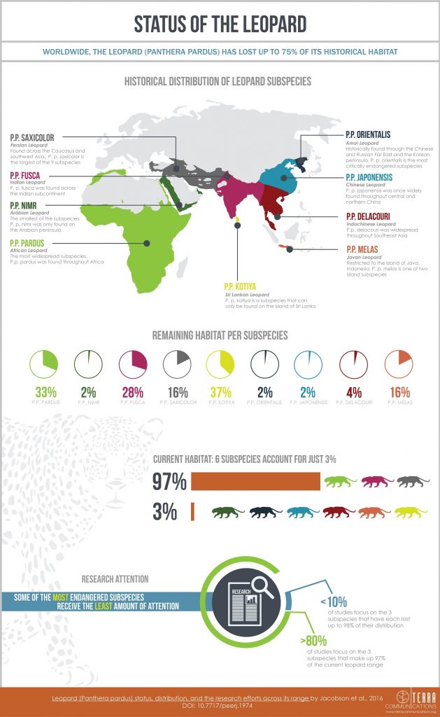
Infographics have become an important medium for communicating science. PeerJ and other journals allow authors to include infographics in their work, and the designs have steadily gained popularity.
However, it is not easy to create effective images, so I sat down with Mary Zambello (who also happens to be my sister), and asked her about the process she goes through when creating a new work.

Q1) What do you start with when creating an infographic?
Data. It’s important to sift through the comprehensive research and decipher what key information you are trying to get across.
Q2) What are the next steps?
Creating a framework for the infographic. I ask myself, “How will you get various pieces of information to come across in a cohesive and structured way?” Make sure your information makes sense to the user. This could involve discussing the design directly with the client to work through details in the data, or reaching out to an outside source, to see if the graphics are understandable and clear.
Q3) What elements do you consider in the overall design?
Style. Story. Simplicity. All of these are important in avoiding confusion by creating flow and connection between each piece.
Q4) What is your favorite and least favorite element in creating an infographic?
It’s fun to design the language of an infographic. How is one figure going to relate to the next? What are the various ways you can represent the same information? It’s tricky at first to really sort through all of the extensive information, to pick out the key points, and make sure your graphics are legible and understandable. By the end, it’s all about simplifying, and creating an impact by sharing information.

